Beginner’s guide to Tasker, part 3: Scenes

In the first part of this guide, I covered Tasker basics, and in the second part, variables. This time, I’ll cover another of the core features that need a bit more explanation: Scenes.
What are scenes?
Scenes are user interfaces that you can create in Tasker. Think of a scene as a box that contains various elements that you would normally find in an app interface, like buttons, text, text input, images, sliders, and so on. Normal Tasker actions can be tied to these elements, so that you can have a button that runs a task, a text field that lets you write text to a variable, or a slider that controls screen brightness.
Scenes can be all kinds of sizes, and be displayed in different ways: As a pop-up box, full screen like an app, as an overlay over another app, and so on. The size and type of scene depends on what you need the scene to do. I will quickly go through the basics of creating a scene, and then I will go through multiple examples at the end to show how everything works in practice and for different uses.
Creating a scene
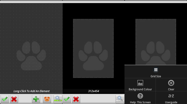
Scenes have their own tab in each project, and you add a new one by tapping the plus symbol. The first thing you see after entering a name is a screen with a box in the middle, and a magnifying glass and ok/cancel buttons on the bottom. When the magnifying glass icon is not lit up with a green dot, you’re in the screen for editing the base “canvas” for the scene. You simply drag the edges of the scene to the size you want, indicated in pixels on the bottom. Currently there’s no way to set the size in pixels directly, something that will likely change now that scenes have a much bigger role due to Tasker’s app creation functionality. Also note that some aspects of how the scene will look are controlled by the action that triggers the scene, which I’ll cover later.
Clicking the menu button will bring up a few options such as grid size and background color. The background color picker is fairly self explanatory, but I should mention that the unlabeled slider controls transparency/opacity. The grid size option controls what grid is used for editing the scene, which affects the accuracy of placing elements on the scene. If you want three buttons of the same size side by side in the scene, you will need a grid size that allows for three identically sized buttons.
“Turning on” the magnifying glass makes a few new buttons pop up, and also shows the grid that you just set the size of on the scene. This is where you edit the content of the scene; add buttons, images, and so on. A few new buttons also appears on the bottom, specifically a teddy bear icon and a plus symbol. The teddy bear button lets you set the touch mode, with the three options being Normal, Move, and Resize. Normal means that you can both move and re-size elements in the scene, all depending on where on the element you touch (middle being move, edge being resize – but on small elements you often only get resize). The other two limit the editing to either moving or re-sizing an element. The plus symbol is for adding new elements to the scene, but you can also just hold down on the scene to get this option.
Holding down on existing elements allows you to do things like copy, delete, hide, pin, set depth, and so on. You can duplicate an element, set one element to display underneath another, pin it so it can’t be accidentally moved, etc.
Configuring elements
There are 11 different elements that you can add to a scene, and they don’t all share the same options. When you add an element, a configuration screen pops up, and there are multiple tabs of settings that you need to deal with for each element.
The UI tab (and background tab where applicable) is normally pretty self-explanatory for all elements, as it deals with how the element looks. Text size, name, text, color, position, icon, and label are just some examples of options you’ll run into in this tab. Note that Name refers to what Tasker uses to refer to an element internally in Tasker, while Label or Text (depending on the element type) are the fields that control what the element will actually display. Variables work fine in these fields, and I’ll show how that can be used in practice in the examples further down.
The other tabs on the configuration screen vary greatly depending on element type. For the most part, each tab is essentially a task, capable of containing actions, and whose name indicates what triggers the action. For instance, adding a button to a scene brings up a configuration screen with three tabs: UI, Tap, and Long Tap. The Tap and the Long Tap tabs are each their own tasks which trigger depending on whether you tap the button or long press it. Anything you want to happen (Tasker actions) when the button is tapped goes into the Tap tab, and similarly with the Long Tap tab. Adding an Airplane Mode: Toggle action to the Tap tab will result in a button that turns Airplane Mode on or off when clicked. Other than being in tabs like this, actions work like you’re used to. You can use multiple actions, limit them using If conditions, and so on.
With 11 element types that all work differently, there are a lot of different tabs to be familiar with. Like with individual actions, there are too many to go into detail with each one, but the Tasker help button is available in the element configuration screens to explain how each element works. The examples at the end of this article will also go into detail on how some specific usage scenarios are configured. Scenes can be used for so many things that examples are a better way of trying to explain the potential rather than trying to explain each component individually. In fact, making elements work together is far more difficult than configuring them on their own, as some of the examples will show.
Triggering scenes
The Scene category of actions currently has 20 different actions available. Most of them have to do with manipulating elements using actions, but the top four actions are different; they control the existence of a scene. These four actions are Create Scene, Destroy Scene, Hide Scene, and Show Scene.
A scene can be active even if it isn’t displayed. You can compare it with how an app can run in the background, and in the same manner, a scene that is active in the background takes up system resources. The Create Scene and the Hide Scene actions deal with this state of visibility, with Create Scene starting up a scene without displaying it and Hide Scene taking a visible scene and hiding it without actually closing it.
Show Scene and Destroy Scene are the two most used options, and the only two of these four that I actually use. Show Scene displays the scene, and creates it (starts it up) if needed. Destroy Scene closes the scene, so that it doesn’t run in the background either. The name “destroy” can be confusing as it sounds like it deletes the scene you created, but it actually doesn’t affect the saved scene “template” that you created in Tasker at all – it simply closes the scene completely. To make this perfectly clear, here’s a short vocabulary of terms often used with scenes:
- Create scene: Starts up a scene in the background
- Show scene: Shows a created scene (and creates it if needed)
- Hide scene: Hides a scene, but still allows it to run in the background
- Destroy scene: Closes the scene completely
This can be confusing since most people would assume that “create scene” refers to what you do in the scene editor. In fact that is often referred to as creating a scene too, so you just have to be aware of the double use of the term. Activate and deactivate would have been better choices for names, but hindsight is always 20/20.
Normally you’d use Show Scene to make a Scene appear, and Destroy Scene to make it disappear and not run in the background. The examples at the end will show a few ways to use these in practice.
Show Scene options
The Show Scene action is the method you’ll most likely use to trigger your scenes and make them appear. Like I said above, this action actually controls some aspects of how the scene will look. Specifically, there is a Display As option in this action that has 9 different states:
- Overlay
- Overlay, Blocking
- Overlay, Blocking, Full Display
- Dialog
- Dialog, Blur Behind
- Dialog, Dim Behind
- Activity, Full Window
- Activity, Full Display
- Activity, Full Display, No Title
These 9 Display As option decide how the resulting scene will display and act. From the Tasker user guide:
All Overlays are displayed over the current application and persist until hidden or destroyed.
Blocking overlays only block touches on the part of the screen they cover.
Non-blocking Overlays are also displayed over the Keyguard.
Dialogs are little popup windows which take all user input while they are displayed and can be dismissed with the Back key.
Activities are standard Android app views.
What you have here is essentially three display types, each with three variations.
- Overlays are meant for scenes that display over part of another app. Let’s say you want to have music controls visible while browsing. You could then make a small scene with music controls, and display that as a overlay at the bottom of the screen when your browser is active (using an app context).
- Dialogs are essentially pop-up boxes, like yes/no dialogs and the likes. You might want to have a profile that triggers on plugging in your headphones, and then pops up a box with several options for apps to launch. A scene displayed using a dialog option would be perfect for this. Do note that there’s an action called Menu in the Alert category which provides an alternative way to create a dialog scene.
- Activity scenes are meant for scenes that work more or less like apps. As a result, you would normally use those options for scenes that you want to act like apps. With Tasker’s new app export ability, many people find themselves using scenes as configuration screens in exported apps.
If you use any of the Display As options that are not fullscreen, you will also get some additional options that adjust the position of the scene. This is particularly useful for overlay scenes which often need to go over a certain part of the screen.
Do note that display type options sometimes act differently on different devices and OS versions. My advice is to try the options out and see which ones work the best for you.
The Show Scene action also has an option to “show exit button,” which is enabled by default. This shows a red exit button in the bottom right corner which will close the scene when clicked. This is a failsafe to prevent anyone from making a scene with no way of closing it. You can really mess up if you use certain display types and disable this without having an exit option yourself, so make sure that you have some sort of way to destroy or hide the scene from within the scene before you uncheck this option.
In the examples that follow, pay attention to how the Show Scene action is rarely on its own in the task that triggers the scene. Very often, you have to do additional preparation in the same task in order to properly create the scene, such as setting an element value (example 1), loading text files into variables (example 2), and downloading images from the web (example 3). Also pay attention to the order of these actions. Example 1 has the Show Scene action first, as the other action manipulates an element in the scene, thus requiring the scene to exist beforehand. Example 2 and 3 have the Show Scene action last, as the other actions in the triggering task gather information that has to be in place before the scene can be created. Like I said, the difficult part of scenes has to do with making all the parts work together correctly, not configuring individual elements.
Example 1: Pop-up settings menu
My pop-up settings menu has been around for a while, and has evolved as I’ve added more to it. I use it as a way to quickly access settings I use often, most of which are settings for my own Tasker profiles and tasks. There’s a slider and buttons for controlling screen brightness, buttons for activating various profiles I have, and more buttons that do all sorts of things.
How it’s triggered
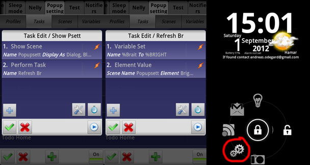
The settings box can be triggered using two shortcuts; one on my home screen, and one on my lock screen. Tasker has a built in feature that allows you to run tasks from shortcuts, which is why I use in this case.
When either of those shortcuts are clicked, a task called Show Psett runs. This contains two actions, Show Scene: Popupsett, and Perform Task: Refresh Br. The Show Scene action is what I described above, and in this case it uses Dialog, Blur Behind as the display type.
Refreshing the slider: a lesson in dealing with generic elements
The second action, which runs the separate task Refresh Br, has to do with the display brightness slider in the scene. To understand why it’s there, you first have to understand how generic scene elements work, as well as how the slider element works.
A slider element in a scene has to be configured with a minimum and a maximum value, which is what the value of the slider will be when the slider handle is all the way to one side or the other. Screen brightness has 255 levels in Tasker, so my brightness slider is set to go from 0-255. When you slide the slider half way, the value is 128, when you slide it all the way, it’s 255, and so on. This is a setting in the slider element’s UI configuration tab.
The other tab in the configuration for the slider element is Value Selected. Value Selected is the slider element’s version of the Tap/Long Tap tabs I mentioned for button elements earlier. Every time the slider handle is moved, Tasker runs any actions added to the Value Selected tab. Additionally, the value that the slider lands on when you release the handle is written to the local variable %new_val automatically. For my brightness slider, moving the handle all the way to the right sets the value of %new_val to 255, and it runs any action in the Value Selected tab.
In this case, this tab contains a single action: Display Brightness, where the Level field is set to %new_val. When the slider handle is moved, the value it lands on is stored in %new_val, and the Display Brightness action uses that value to change the screen brightness. The result is that sliding the slider all the way up sets the screen brightness to 255, which is 100%.
It’s important to understand that the slider doesn’t know that it’s a brightness slider. All it does is turn a position on the slider into a value, and that’s it. As such, the slider handle will start at 0 every time the scene is created, because the slider neither knows nor cares what the current brightness level is. In order to make the slider handle be in the correct position on the slider when the scene pops up, you have to actually tell the slider where the handle should be positioned. This is what the Refresh Br task does.
As you can see above, this task consists of two actions: Set Variable and Element Value. Element Value is an action in the Scene category, and it allows you to manipulate the value of an element using a task. In this case, we want to tell the slider to put the slider handle at the same level that the screen brightness is currently at. If you’re at 25% brightness, you want the slider to be 1/4 of the way to max, and to make that happen, you need to tell the slider to start there. By running an Element Value action that sets the value of the slider to the current brightness level as part of the same task that triggers the scene, the slider will be in the right position when the pop-up box appears.
So, what about the Variable Set action? Well, the Tasker dev messed up a bit when he created the Element Value action. The Value field only accepts global user-created variables and numbers, so we can’t use the built-in variable %BRIGHT (which always contains the current brightness level) in that field. To work around this “bug,” I copy the value of %BRIGHT into my own variable %Brait, and use that variable in the Value field instead. It’s a weird and slightly annoying bug, but worth noting since a brightness slider is a useful thing to have in a scene, so you might run into this situation yourself.
To put all of this in words, this is what Tasker sees the Show Psett and Refresh Br tasks as:
Show the pop-up settings scene and move the slider handle so it matches the current screen brightness
Where the red text indicates what Show Scene does and the blue text indicates what the Refresh br task does.
The important lesson to take from this is that elements in a scene are generic, and that means that they won’t always work the way you think they would work. In this case, the slider is used to control the brightness level, but the slider doesn’t know that, and so it needs you to tell it that the brightness level has changed without it in order to display that properly. In example 5 you’ll find a use for the slider that proves pretty conclusively that it doesn’t have to be a brightness slider.
As for why the two actions in Refresh Br are in their own task instead of being part of the Show Psett task, that was originally in order to refer to the same refresh task from other places than just that one task. I ended up changing the system to where only the Show Psett task actually uses that task, meaning that it doesn’t need to be its own separate task at this point. However, in the todo list example below, I will show you an example of where such separation does have a use.
The scene
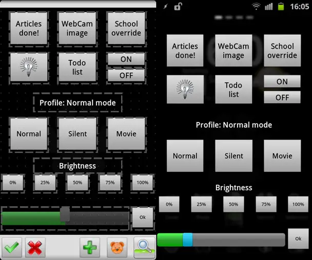
This is what the scene edit screen looks like for the pop-up settings scene, and what it looks like when actually triggered. It’s a collection of button elements, text elements, and a slider element. As you can see, I’m using a grid size that allows me to space out buttons of various sizes evenly, and finding the right grid size for that to be the case can often be a pain.
In this case, the settings box actually looks like it’s fullscreen, even though the Display As type is Dialog, Blur Behind. That’s because the scene itself covers most of the screen, but you can still see the status bar shining through, and the effect of the Blur Behind option.
Also note the position of the slider handle. The brightness is set at 25% in that image, and the slider reflects this – because of the Refresh Br task. Without it, the brightness would still have been 25%, and the slider would still have been able to control the brightness, but it wouldn’t have displayed the correct brightness unless it was the one to set the brightness.
Top seven buttons
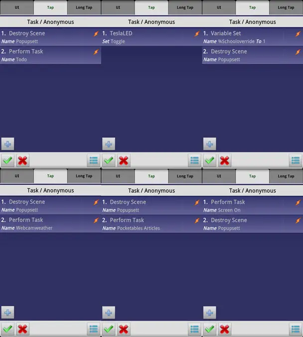
The top seven buttons all do different things, but are all rather basic. Most of them have two actions: Perform Task and Destroy Scene. Destroy Scene closes the pop-up settings scene, while Perform Task runs a separate Tasker task. Two of the buttons, WebCam image and Todo list, trigger new scenes which are separate examples above. The reason why the TeslaLED task doesn’t use Destroy Scene is that it toggles the LED light on my phone on or off, so I want the scene to stay active (not close) when I click the button, so I don’t have to start the scene up again to toggle it off after I toggle it on.
The actual functionality of the tasks behind the Perform Task actions here isn’t important, the point is just that I use these buttons to toggle other tasks from a central location. For the record though, the seven buttons do the following: Run a task that archives the articles I’ve written on this site that day, opens a “virtual window” scene with WebCam images, overrides an active school profile using a variable, toggles the LED, opens my todo list scene, turns my computer monitors off wirelessly, turns my computer monitors on wirelessly.
Profile buttons
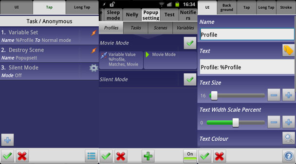
The three profile buttons control a profile system that is separate from my automated profiles that I talked about in part 2 of this guide. They’re designed to be activated manually, which is why I have buttons for them. Each button closes the scene (using Destroy Scene), sets the variable %Profile to a specific value, and in the case of the Normal mode button, deactivates silent mode.
The values that %Profile is set to in this case are literally “Normal mode,” “Silent mode,” and “Movie mode.” Movie mode and Silent mode are separate profiles altogether, both of which uses Variable Value as the context. In order for the Movie Mode profile to be active, the value of %Profile literally has to be “Movie mode.” In the previous article I talked about advantages of using number values instead of text values for variables that are used as settings, but in this case, using a (complicated) text value has one big advantage. That advantage can be seen in the right image, where the text element is set to display “Profile: %Profile.” Since the value of %Profile is the full name of the currently active profile, the text element will end up displaying the name of the active profile (this can be see in the screenshot in the “The scene” section above. Had I sued 0/1/2 instead of Normal mode/Silent mode/Movie mode as the values, the text element would for instance have displayed “Profile: 1.”
That little lesson in variable value naming aside, this profile button setup demonstrates how you can activate and deactivate entire profiles using scene elements. The scene elements (buttons in this case) set a variable to different values, and then various profiles trigger depending on that value.
Brightness controls
I already explained how the slider works, but as you’ve probably seen, there are also buttons present that set the brightness to specific values. These buttons simply set the brightness to the specified level (measured from 0-255, so that 50% is 128), and then destroy the scene. As for the OK button, it only does one thing: Destroy Scene. That button is there for when I use the LED toggle or the brightness slider, as those two elements don’t contain their own Destroy Scene action. Like I explained earlier, the choice not to include a Destroy Scene with those is because I expect to want to continue using the scene after I interact with them, and so having the scene go away would be annoying.
Example 2: Todo list
A month ago I gave up on commercial todo list systems and made my own in Tasker. I didn’t go into details on how I did it back then, but I will now, as most of it happens in a scene.
How it’s triggered
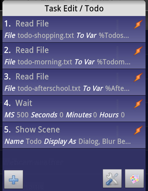
The todo list system currently consists of three lists, each for a different situation. I get notified of items from the shopping list when I walk outside, the morning list when I get up, and the home list (listed as “after school” in parts of the system) when I get home. These lists are stored as physical text files on my phone, but Tasker needs these to be variables to display their content. As such, the first three actions in the task that triggers the todo list scene are Read File actions. These actions read the text files and turn them into variables, one for each list.
The fourth action is a Wait action, the purpose of which I’ll get into later. It simply delays the rest of the task by half a second.
The fifth and final action is the Show Scene that actually makes the scene show up. Like the previous example, the Display As setting is set to Dialog, Blur behind.
The task itself is triggered from the pop-up settings box in example 1, using the Perform Task action.
The scene
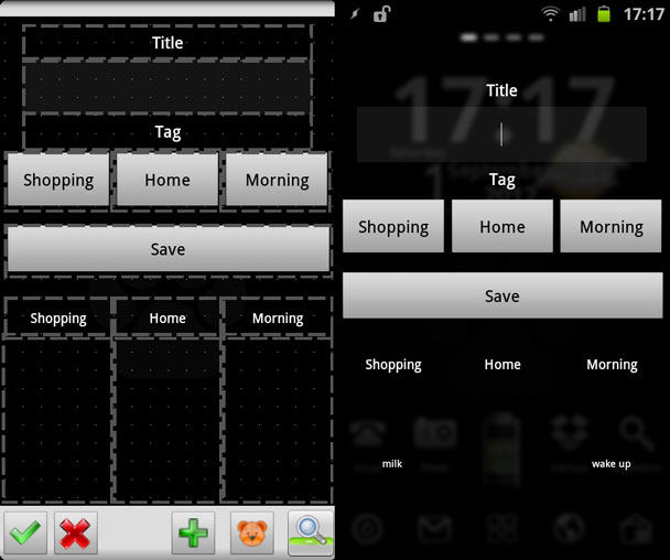
This is what the scene looks like in edit mode and in actual use, with some examples thrown into the latter for good measure. The field between Title and Tag is a text input field, and the three fields at the bottom are text fields.
Text input field, tag buttons, and save button
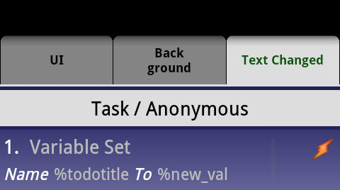 Text input fields work a lot like slider elements. Each time you input something in the text field (i.e. for each and every letter), it writes the content of the text edit field to the local variable %new_val. It also runs all actions under the Text Changed tab in its configuration screen, just like how the slider runs all actions in the Value Changed tab when the handle is moved.
The problem with this is that if you’re typing, you’re going to run those actions a heck of a lot of times. As such, I advise that you keep the number of actions in this tab to the bare minimum. For me, there’s only one action, which transfers the value of %new_val to my own variable, %todotitle. I don’t actually think I even need to do that, but I have an old habit of using user created variables.
Point being, when I’m done typing into the text field, there will be a variable %todotitle that contains whatever was typed into the field.
Next up is the tag buttons. These are very simple buttons that set the variable %Todotag to Shopping, Home, or Morning respectively.
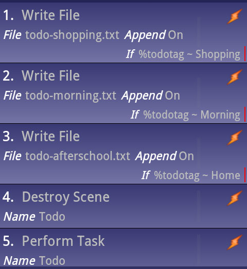 The Save button is where the actual magic happens. When clicked, it appends the corresponding text file with the value of %todotitle (plus a line shift) depending on the value of %todotag. In other words, whatever you wrote in the text input field is added to the text file for the list you selected using the tag buttons. It filters this using If conditions on the Write File actions.
The important lesson here is how the use of a separate Save button means that I can put the actual Write File action out of reach of the “rapid fire” Text Changed tab. If I had put Write File in the Text Changed tab for the text input field, it would have written to the file every time a new letter was put in. Not only could that cause problems for the system, but you couldn’t use the append option for adding the text to the end of the file, as it would then repeat all preceeding letters as well when it wrote new ones. Inputting “apple” in the field would then result in a file like this:
aapappapplapple
I can’t emphasize enough that making everything work together is what’s difficult with scenes, and this is just another example.
After it has saved the text to a file, it destroys the scene, and runs the task that triggers the scene all over again (the one described at the beginning of this section). The point of this is to refresh the entire scene in as simple a way as possible, clearing the text input field and updating the text elements so that they display the new content of the text files.
This is where the 500ms delay comes in. I had trouble with the scene not reloading properly when doing it without a delay, so I added one. Sometimes you just have to manually give tasks a bit of breathing room by adding wait actions.
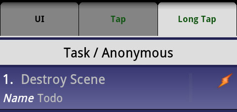
The save button also has a second use, triggered by holding down the button instead of just quickly clicking it. This is done by adding actions to the Long Tap tab, in this case a simple Destroy Scene action. Since clicking the button will make the scene reload, I needed a button that actually closes the scene. Instead of adding a separate button, I simply added a second use for the Save button.
Text elements
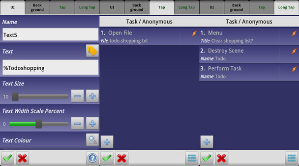
The bottom part of the scene consists of six text elements: fields that list the contents of the three todo lists, and corresponding labels on top. The labels are static, but the lists are dynamic.
First of all, each list has a variable as the content of the Text field. They’re the variables that are created by the initial task that creates the scene, and contain the contents of each of the todo lists. In other words, each of the three text elements contain the text stored in the text files. Whenever the initial task is run by destroying the scene and running the initiation task again, these variables are refreshed.
The Tap action for each text element is top open the corresponding text file. This opens it in whatever app is set to open text files, and this is frankly just a very quick and simple way of adding a way to edit todo lists. I very rarely have to do so, as I normally clear the entire list at once, but it’s nice to have the option.
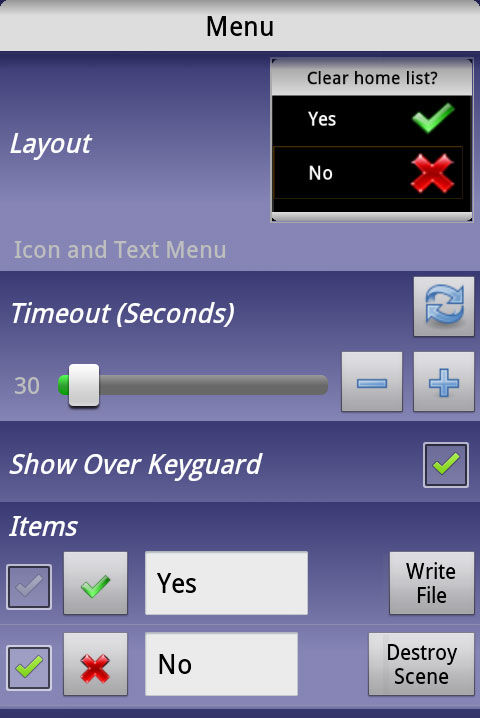 The Long Tap task for each element does three things. First, it displays a new dialog scene the quick and dirty way, by using the Menu action I briefly mentioned earlier. The Menu action technically creates a scene, one you can modify the looks of even, but you configure it via the action’s own options, not the scene editor. It’s quicker when you just need to create a quick dialog scene, like here. This Menu scene asks if you want to clear the corresponding todo list.
There are two options in this Menu scene, Yes and No. No destroys the Menu scene, and then the initial Long Tap task continues, closes the todo scene, and restarts/refreshes it using the same method as with the save button. The Yes option writes a blank space to the corresponding todo list text file, with append unchecked. The append option for Write File decides whether or not the new text is added to the end of the file, or if it overwrites the file. The Save button Write File actions have append enabled, but this one doesn’t, as it’s supposed to clear the list.
There are a couple of reasons why I write an empty space to the text file instead of writing nothing or deleting it. If I had used Delete File to delete the file, then Tasker would have given me an error when it tried to read the file into a variable as part of initiating the scene. If I had written nothing to the file, then the variables created by Tasker when initiating the scene would have been blank. As explained in the previous article, this causes Tasker to literally display the name of the variable where the variable is used. In other words, an empty list wouldn’t display as empty in the scene, instead it would show the name of the variable, like %Todoshopping.
After you click yes, the todo scene is destroyed, then recreated to refresh it.
The non-scene part of this list
Since I know for a fact that there are people out there who tried to make a todo list system like mine and failed, I’ll also briefly mention the side of this system that isn’t scene related – just for the sake of not leaving it half done. What this scene does is to give you an interface for creating and managing the todo list, but the other component to the puzzle is a way for Tasker to check it and act based on it.
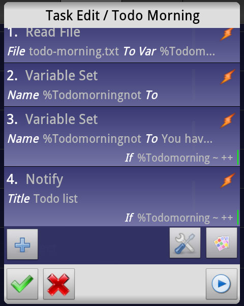
The image above shows my Todo Morning task. The purpose of this task is to check the morning todo list and notify me if there are any items in it. It starts off by reading the text file that contains the list into a variable. If that list is empty, the variable will contain only a space (ref. the way I clear the list above). As such, I can use an If condition for %Todomorning Matches ++ to check if there are any items in it. ++ means “at least two letters,” which is true when there are any actual items in the list, but not true if there’s only that one single space.
Action 4 in the list above creates a notification with %Todomorning as the text, but is limited by this If condition. As a result, it only creates the notification when there are items in the list.
Action 2-3 are not really relevant, but I’ll explain them for the sake of not leaving any questions. This Todo Morning task runs as part of a much larger task that runs when I get up in the morning, and I want the spoken message that I get when that happens to mention if I have any items in my todo list. I do this by setting the variable %Todomorningnot to “You have items in your todo list” using the same If condition as action 4 above. %Todomorningnot is then inserted into the Say action in the main morning task. Action 2 makes sure that this variable doesn’t contain anything if the If condition is not met.
The final result is that if the list contains any items, a notification will be created, and my morning message will notify me of it. If the list is empty, there will be no notification and no message.
Example 3: Virtual window WebCam scene
My virtual window has been the topic of a short article before, but I didn’t go into much detail. Just like the todo list, this is also all about the scene.
How it’s triggered
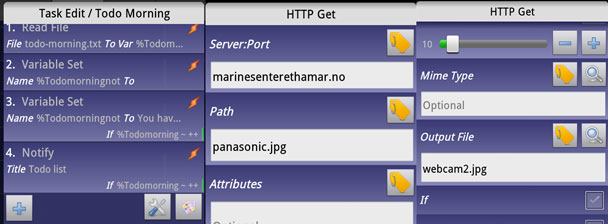
This scene is also triggered by a task linked to one of the buttons in example 1. The scene itself contains images that have to be downloaded from the web, and because of this, the Show Scene action is at the end of the task. The three actions before it are HTTP Get actions, which are used to download the images. The images are saved to a specific path, so that each time the task runs it overwrites the existing images.
It’s imperative that the Show Scene action is run last here, or the scene would load the old images.
The Display As type in this case is Overlay, Blocking. In this case it doesn’t really matter though.
The scene
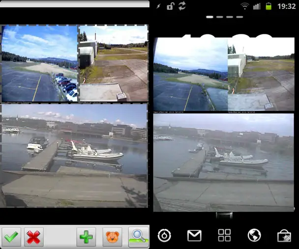
The scene is as simple as it gets. It has three image elements, each of which uses one of the downloaded images as a source. The images have been moved and re-sized in the editor, and even though it loads newly downloaded images each time it’s displayed, it keeps the same layout.
Each image also has Destroy Scene as the Tap action. That means that tapping any of the images will make the scene go away.
This is a very simple scene from a technical point of view, but I use it a lot. It also demonstrates the use of dynamic images, which has many applications. You could for instance create a scene that shows today’s new web comics when you click a button.
Examples 1-3 in practice
Examples 2-3 are triggered with buttons in example 1, so I thought I would create a simple video to show how all of this looks in practice. There’s a lot that goes into making everything in a scene work the way it should, especially when there’s a lot that has to work together. As you can see in the video though, it’s all quite simple when you actually get to where you can use it.
Example 4: Gmail notification
The first three examples are all fairly standard uses for scenes. This one is not. It all started with a wish to add a more visible notification for incoming emails, similar to notification LEDs on some devices. I experimented with using the camera LED, and that worked well, but it wasn’t quite as…elegant as it could be. My Galaxy S II has an AMOLED screen, and one of the advantages of such a screen is that the color black is created by turning off the pixels. Black pixels are therefore just the screen being off, and you can’t tell a black bezel from the screen when that’s the case.
I came up with the idea of having a Gmail logo be displayed on the screen, in such a way that it appears as if only the part of the screen with the logo actually turns on (which is in reality what actually happens as well, due to the way AMOLED technology works). The video below is the result of this idea, and all the magic is done with Tasker scenes.
How it’s triggered
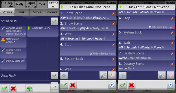
Part of what makes this example so different is how it’s triggered (or perhaps controlled is a better word in this situation). First of all, this scene is triggered automatically using a profile and a context. Four contexts, to be exact. The main one is an event context for any notification from the app Gmail. In other words, this context is triggered if Gmail receives a notification, which is only when it receives an email in my case.
This event notification is further filtered using three state contexts. The variable %Sleepmode can’t match “on,” the Home profile has to be active, and the display has to be off. The first of these is to prevent the profile from being active when I sleep. The second is to make make sure it only runs when I’m home (I have a different Gmail notification system for other locations). The third is to make sure it only runs when the display is off, so that it doesn’t start interfering with me using the device.
Now, to the task that creates the scene. The first action shows the Gmail Notification scene, which is the Gmail logo on a black background. The display type is Overlay, Blocking, Full Display. The second action is another Show Scene, this time for a completely black scene, with display type Activity, Full Display, No Title.
So, why two scenes? In my testing, I found that (on my device and ROM, this might very well be device-dependent) the Overlay display type wasn’t capable of turning on the screen of my device. The Activity display type is, but its definition of Full Display doesn’t include the status bar, leaving it visible. By using two scenes – one of each type – I managed to get a scenario where the scene will turn on the display, and it will actually cover the entire screen with a black box, meaning the pixels will stay off on an AMOLED screen.
Since I initially created this system, I’ve rooted my device, and I can now use the Secure Settings plugin to wake the device. Still, I don’t tend to fix something that’s not broken, and the non-root method is a better example of how you can use scenes creatively.
On to action 3, that one’s a Wait action which decides how long the display will stay on for (as action 5 is System Lock). The Gmail logo is clickable, and clicking it will bring you to the Gmail app, so action 4 is there to prevent the rest of the task from running (and in doing so, turn off the screen) if I do indeed click the logo. The variable that the Stop action has an If condition for is set when clicking the logo, as you’ll see further down.
Action 6 is a new wait, this time to make sure that the lock screen animation has time to finish before the two scenes are destroyed with actions 7-8.
When all of this works together, you get the result in the video above.
The scene
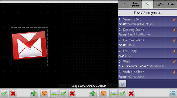
The two scenes here aren’t very interesting in themselves. The Gmail Notification scene has the Gmail logo, and that’s about it. There are however quite a few actions tied to the Tap task for the image. First, it sets the %Gmailactive variable, which in turn controls the Stop action I mentioned above. Then it destroys the two scenes used to create the notification. Next, it loads the Gmail app, allowing me to actually read the email that came in. Finally, it waits for 6 seconds, and then clears the %Gmailactive variable, resetting it for next time.
Like I said, this is a fairly peculiar use of scenes, but it’s also one of my favorite Tasker setups. My phone is normally sitting in a DIY cradle on my desk when I’m at home, with the screen pointing towards me, so having a visible notification is great. Being able to limit it to when I’m at home and not using the phone makes it that much more useful. For the record, when I’m not home, the notification switches to three one second vibrations instead of this setup.
Example 5: Lock screen using scenes
The previous examples have all been from my own Tasker setup, with scenes and systems I know well. For this last one I’ll do a reader request from a previous Tasker article and create a lock screen in using scenes.
How it’s triggered
Since we’re talking about a lock screen, the logical thing to do would be to trigger it on Display On, which is an event context. The problem with that is that since it takes a few milliseconds to show the scene, you get this lag effect when using that context – at least on my older Galaxy S II.
The alternative is to trigger it on Display Off. This might seem backwards, but the advantage is that the scene is then ready to go when you turn the screen back on, making that part faster. This method does however also have its disadvantages.
First off, any elements in the scene will have been created when the screen was turned off, and might be outdated by the time you turn it back on. As you’ll see later on, I added a simple text element with %TIME as the text to my test lock screen, which resulted in a “static clock” that displays the time that the scene was created (but doesn’t change on its own). That means it’s useful for checking the time quickly by turning on the screen if the scene is created at the same time, but not if it (and the time) is from back when the screen was turned off. It is however possible to half fix this by adding a profile that does trigger on Screen On, and use it to update the time-sensitive elements by using the various element update actions in the Scene category of actions. You then get a scene that appears quickly, but with the wrong data, which is then updated after a split second.
The second problem with using Screen Off is that if you have a security lock screen (e.g. pattern unlock screen) below your Tasker-created lock screen, you need to use the dialog display type to make your own lock screen be on top (if that’s what you want, of course). Unfortunately, any dialog scene also turns the screen back on, so when you lock the screen, it will create a scene that turns the screen back on. You can half fix this issue too, by adding a System Lock action after the Show Scene action in the task. You then end up with a lock screen that flashes briefly when turning the screen on.
So, bottom line, both of these methods have issues. If you’re not overly picky about it though, the split second you have to wait when using the Screen On context isn’t too bad.
Creating a lock screen scene
Now this is where the fun begins! There’s so many things you can do to create a lock screen in Tasker, and the end result can be pretty impressive.
I started out by adding a slider, picking the Tasker icon as the handle (or thumb as Tasker calls it), and setting it to go from 0-100. Then I went to the Value Selected tab and added a Destroy Scene action with the If condition %new_val Maths: greater Than 90. Why? Slide to unlock! When you slide the slider past 90% to the right, it destroys the scene, and the screen “unlocks.”
Next I added the “clock.” It’s a simple text element with %TIME as the text, as I explained above. Using a large text size makes it look like a widget. You also have %DATE, %BATT, and a ton of other built-in variables to help populate your lock screen scene. Just remember that the more dynamic content you add, the more you have to update using a second profile if you should choose the Display Off option for triggering the scene.
Next I added a Gmail logo by inserting an image element and using the Gmail app logo. I added an action to open the Gmail app as a Tap action, as well as a Destroy Scene action to close the lock screen when doing so. Since I don’t plan on using this lock screen system myself, I cheated and added static text to display new emails beside the icon. Adding an actual email counter (or SMS counter for that matter) is not a problem.
Finally, I added a static image of my dog, just to fill the screen. If I were to actually use this though, I would have used the rest of the space for something else, like owner information and the likes.
Once your scene is done, all you have to do is link a task that triggers it to your preferred context.
Situation-dependent lock screens
While I don’t plan to replace my WidgetLocker lock screen, there is one advantage of this scene system that makes me very tempted to do just that: Having situation-dependent lock screens. You can easily create multiple scenes for different occasions, like one for home, outside, school, work, and so on. Many people, me included, have profiles for various locations and situations, and using those to control which scene is displayed is as easy as having multiple Show Scene actions with If conditions.
Why WidgetLocker doesn’t have profiles is something I can’t fathom, but from what I’ve seen of the developer’s response to user feedback there isn’t much hope. Despite that though, using scenes as lock screens isn’t quite there yet if you ask me, but it’s ridiculously close for something that wasn’t designed for it.
In closing
This has been a very long part of the guide, with a stronger focus on examples than on theory. That’s simply because the scene feature has so much potential that I think it’s easier to understand how it works by seeing real life examples. As you’ve probably noticed though, there are a lot of minor things here and there that makes each scene unique, from having to pre-load data before creating a scene to using multiple scenes to combine their advantages.
The next part of the guide will cover data processing using variables, which is something that opens up for a whole range of new uses for Tasker.

